Romantic Era: Realism and Impressionism
Realism and Impressionism in the Romantic Era
Background Information
The Romantic Era in the 1800s was categorized as introducing so many new styles of art across the globe. In past eras, only one or two styles were prominent at a time. Although, the Romantic Era created a large shift with newly developed styles including Realism, Impressionism, Post-Impressionism, and Photography to name a few. For the sake of this blog, there will be a comparison between the styles of Impressionism and Realism.
Impressionism was an art style that developed near the end of the nineteenth century in Paris. In terms of art, it was more unconventional for the time because the artist strived to capture fleeting moments. A few things that categorize Impressionism are its loose lines and brush strokes, its fusion of multiple colors, its depiction of transitory effects of weather and light, subjective interpretation, and in-the-moment images. On the other hand, the style of Realism spanned from the 1840s to 1880s as a reaction against romanticism. This style was characterized by depictions of everyday life, its non-idealized nature, its absence of theatricality, and real-life events. Even though Impressionism and Realism were respective styles in the Romantic Era, they are distinct in more ways than one.
Impressionism: Works by Degas and Monet
The Dance Class by Edgar Degas in 1874
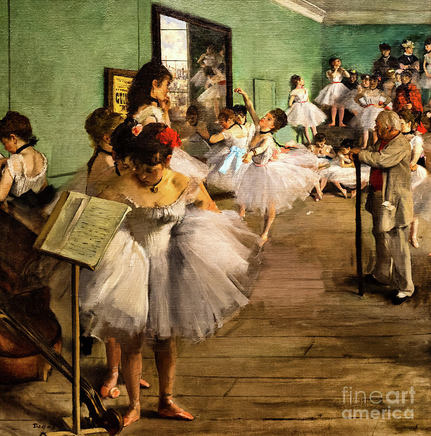
Edgar Degas painted the oil painting titled The Dance Class in 1874 in Paris France. His work was part of the first impressionism exhibition that moved away from works displayed in the Salon. This particular ballet scene depicts the behind-the-scenes moments of a group of dancers waiting to be evaluated by the ballet master. The intention of Degas' painting was to portray the more raw moments of performance that many don't see. This beautifully crafted snapshot breaks traditional narratives by illuminating an unchoreographed moment in a profession that relies heavily on choreographing every movement perfectly.
I really appreciate Degas' work due to his utilization of light, texture, and perspective. In terms of light, Degas incorporated outside light shining through a window, which can be identified in the mirror found on the left-hand side, which is filtering in through the right. The light adds necessary contour to the figures bringing them to life. Loose brushstrokes are one of the characteristics of this art style and it adds a great element of texture as seen on the dancer's tutus, making it seem like there is an abundance of layers. Perspective in this piece is seen as asymmetrical which allows the viewer to look at the unfolding scene on a flat plane.
What I love about this piece is that at first glance it may seem like the dancers have the utmost amount of grace. Although, it is important to take a second and even closer look. All of the figures actually give off a feeling of awkwardness. The girl in the front is having trouble with her tutu, the woman is biting on her nails, and the dancers on the steps are fixing their dresses. Degas did a wonderful job of creating a more modern image that makes on-lookers stop and take a double-take.
The Gare Saint-Lazare by Monet in 1877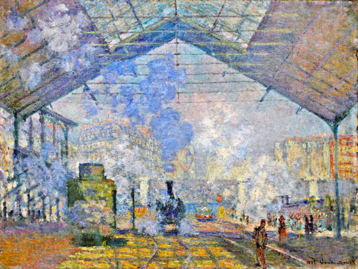
The second Impressionist piece to look at is titled The Gare Saint-Lazare created by Monet in 1877 in Paris, France. Just like the piece by Degas, Monet captures a fleeting moment, incorporates light brushstrokes, and fuses colors together in the most beautiful way. Monet painted this moment at the train station in order to bring to life an ordinary part of the new urban life in Paris. At the time, Paris had been rebuilt, and so, Monet paid extra attention to adding new city additions including apartment buildings and the modern architecture of the trains themselves. The Gare Saint-Lazare does an amazing job of depicting the beauty of modern life.
Art elements that immediately stood out to me were the use of color, texture, and light. Monet mixes an abundance of colors together to not only adhere to the Impressionist style but to create a more fluid image that interconnects various aspects of the scene in an untraditional fashion. Only again, texture plays a big part in this masterpiece. Most impressively, the texture of the fleeting nature of the figures redirects the spotlight onto the form of the trains. Transportation was a way of social class mixing and Monet highlights this fact by reducing the human figure with brushstrokes. Finally, light is seen through the massive amounts of steam coming from the train. Through the use of light, Monet is able to portray the transitory effect of smoke throughout the bustling station.
I find every aspect of this piece greatly appealing. The fusion of lighter colors is breathtaking. It is truly awe-inspiring how Monet was able to incorporate elements of the more urban modern way in the most subtle ways. For example, it took me a while to locate the apartment building behind all the steam. I appreciate that both of the Impressionist paintings have required me to take very close looks in order to gain the whole meaning of the respective pieces.
Realism: Works by Friedrich and Constable
Wanderer above the Sea of Fog by Caspar Friedrich in 1818
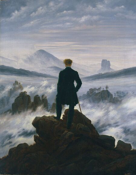
After looking at two examples of stunning Impressionist works, we will focus our attention on pieces that adhere to the Realist style, also termed Realism. Caspar Friedrich created his notable work, Wanderer above the Sea of Fog, in 1818 and is thought to have been painted in Dresden, Germany. One can see the figure on the rocks overlooking the cloud-filled landscape, relying on the presence of his cane. Friedrich created this piece as a reaction to Enlightenment ideals like logic and order. He desired to create a piece that not only focused on the expansive subject of nature but on the figure who is encountering an unknown world in front of him. The idealized nature of art is absent from this painting and is replaced with raw, unknown feelings of reality.
Many artistic elements bring more meaning to the painting including color scheme, utilization of texture, and presence of light. The color scheme is more gentle and muted which contributes to the overall ominous feel of the piece. Texture found in the wisps of clouds and fog adds to the rejection of the idealized nature. The fog serves as a symbol of the unknown because it is concealing what is below it. Finally, the hints of light can be seen as breaking through the clouds in the distance adding to the expansive feel of the piece. All three of these distinct artistic elements add the necessary depth to the work as a whole.
I am personally not drawn to the Wanderer above the Sea of the Fog. Although, I do appreciate the non-idealized nature and absence of theatricality in it. The colors are a little too muted for my taste. I also feel like there isn't much detail in the painting to be examined. While realism isn't my favorite art style of the Romantic Era, I enjoyed learning about various aspects of this particular piece.
The Hay Wain by John Constable in 1821
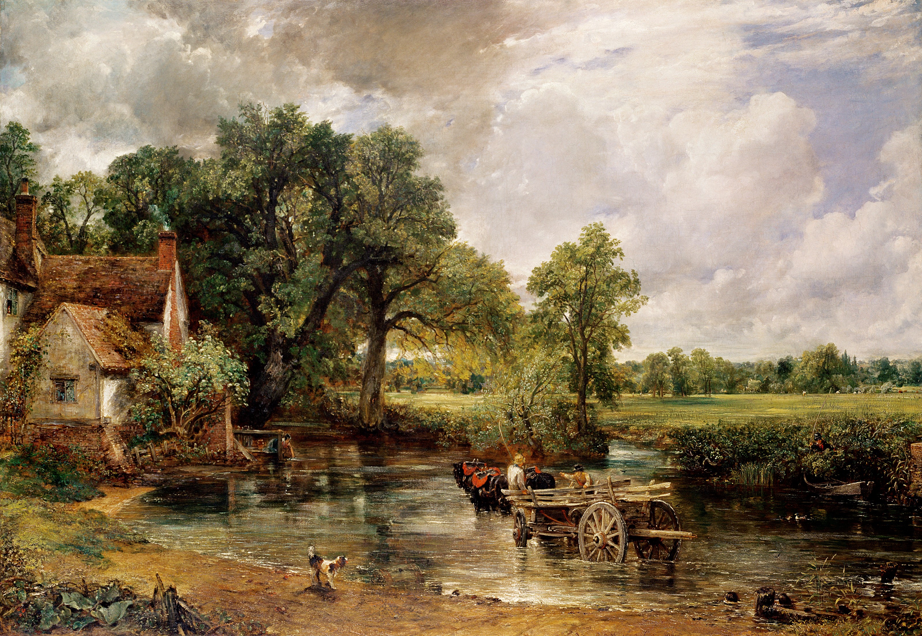
The final piece to examine is titled The Hay Wain which was created by John Constable in 1821 in London, England. Landscapes as the center of artistic paintings were sort of a new trend that started in the midst of the Romantic Era. John Constable painted a scene of the Stour River, the place where he grew up. His intention was to develop a piece that created beauty in a place that many viewed as the lowliest subject in the nineteenth century. Finally, Constable related to the Romantic Era by creating a piece that was both personal and emotional in his eyes.
The utilization of abundant light, rough texture, and muted color tones are three elements that are of great importance to Constable's work. The painter uses the sky as the only source of light which then naturally illuminates the landscape as a result. The addition of light from above allows the river to glisten in a beautiful manner. The rough texture and lack of finish were intentional on the house, ground, and foliage to pay tribute to the various rough textures found in real-life nature. Muted color tones add to the style of Realism by making the everyday scene seem realistic. The working life wasn't overly glamorized and so Constable's painting wasn't crafted in that way either.
Just as I wasn't drawn to Friedrich's painting, I wasn't overly drawn to Constable's either. It is appealing that both of the works portraying Realism depict scenes that are down to earth and a true reflection of everyday life. Sometimes seeing overly idealized pieces can grow old and overwhelming. On the other hand, nothing in this piece, spanning from the use of varied texture to more bland colors, was necessarily striking or awe-inspiring to me.
Conclusion
After looking at all four of these respective works, it is quite apparent that Impressionism and Realism are starkly different in many ways and forms. Impressionist paintings are more lively containing multiple color fusions and depicting fleeting moments. The examples of Realism focused more on muted landscapes that represented non-idealized subjects and focused on the more mundane everyday events. While I didn't really relate to any of the artist's intentions behind their masterpieces, it was quite interesting to uncover what they were trying to convey through their art. It is truly amazing that the nineteenth century was filled to the brim with so many different art styles!
Resources:
“Dance Class.” Great Works of Western Art - Dance Class, http://www.worldsbestpaintings.net/artistsandpaintings/painting/188/#:~:text=The%20painting%20was%20not%20intended,poses%20and%20unexpected%20vantage%20points.
Ostergaard, Dr. Tyler E. “Monet, the Gare Saint-Lazare.” Smarthistory, https://smarthistory.org/monet-the-gare-saint-lazare/.
“Realism Movement Overview.” The Art Story, https://www.theartstory.org/movement/realism/.
Zucker, Dr. Steven, and Dr. Beth Harris. “Edgar Degas, the Dance Class.” Smarthistory, https://smarthistory.org/edgar-degas-the-dance-class/.
Zucker, Dr. Steven, and Dr. Beth Harris. “John Constable, the Hay Wain.” Smarthistory, https://smarthistory.org/hay-wain/.

I am impressed with the amount of detail and understanding that went through in this post. I also agree that many of these art styles were introduced in the 19th century. In my opinion,
ReplyDeleteThe Hay Wain by John Constable in 1821 is such a gorgeous piece of art and I would probably like to own one if I could
Hello! I really like the artwork Wanderer above the Sea of Fog by Caspar Friedrich. The artist is glorifying the feeling of hope and and curiosity to the world around us. I like the colors this artist used because it looks like he is surrounded by clouds when using darker and lighter colors of complexion. In these examples I do prefer realism because it has a deeper meaning behind the artwork. Thank you for sharing!
ReplyDeleteThis comment has been removed by the author.
ReplyDeleteHello Libbey, I like that you picked two landscape-type scenes and two where people are the focus to highlight the differences between Impressionism and Realism. Edgar Degas’s The Dance Class seeks to illuminate others to a new way of thinking and viewing the world, as was the Impressionists' goal. Degas accomplishes this task by depicting the usually unseen moments of the ballet. The Dance Class is one of the more controlled and refined Impressionist images. Despite this, the painting still exhibits controlled instances of quick, textured brushstrokes to enhance the various elements of the work. The desire to peek behind the scenes of such polished acts was a very modern occurrence and thus perfect for the Impressionists who sought to capture these fleeting moments of contemporary life. Monet’s The Gare Saint-Lazare is what one more typically expects from an Impressionist painting. A modern train station created using vivid colors and short, textured, sporadic paint strokes is precisely the sort of hazy imagery that the Impressionists became famous for. The blurred lines, vivid colors, and expert lighting make The Gare Saint-Lazare feel so nearly magical when depicting even something as simple as an urban train station that people usually see as eyesores.
ReplyDeleteThe Realist style is the opposite of Impressionism in almost every way. Where Impressionism has hazy lines, vivid colors, and unblended textured paint, Realism has muted colors, sharp, nonidealized images, and smooth finishes. Caspar Friedrich’s Wanderer above the Sea of Fog is an excellent example of these muted colors and of man against a harsh landscape that all add to a feeling of foreboding. I agree that the colors are too dull for my taste, but the image's fog and lighting create beautiful depth. The Hay Wain by John Constable is brighter and more detailed, which draws me to it more than Friedrich’s painting. It is a somewhat calming image, but on closer inspection, the dark clouds on the horizon make the viewer think twice and creates an uneasy feeling. While The Hay Wain is well crafted and portrays a muted, nonidealized depiction of working life that Relists sought to capture, I don’t see anything particularly unique about the painting. I do, however, appreciate the cottage on the shore that harkens, I feel, to later works by Thomas Kinkade and others. It seems to me that the Realist artist that was presented was trying to convey more feelings of uncertainty and impending doom. In contrast, the Impressionists sought to capture brief moments overlooked by many. For all their vivid colors and far more unique style I prefer the Impressionists.
Hi Libbey, I must say that you have chosen some interesting paintings. I really like the use of colors in The Dance Class. Degas has done a great job in this, as the colors create a sense of movement and emotion. This painting is widely interpreted as a commentary on the rigor and discipline of ballet training, while also reflecting the social and economic context in which ballet was practiced in the 19th century. Degas intended to capture the reality of the ballet that is hidden behind the description of the cool and carefully constructed choreography. This has given me a better understanding of the painting. Moving along, I will say that the use of muted colors in The Hay Wain stands out a lot, making the paintings look very realistic. Constable has done a great job of making use of color to capture the natural beauty and tranquility of the scene. The Hay Wain is a painting that speaks to the beauty and simplicity of rural life, along with the power and majesty of nature. The painting captures the essence of the English countryside and has come to represent a vision of a simpler, more authentic way of life. Constable intended to celebrate the beauty of the English countryside. I really am enjoying the beauty of the English countryside. Overall, I will say that Impressionism is a really nice style, but I do prefer Realism because it depicts more beauty. Once again, you have done a great job on your post, and I hope that you keep up the good work.
ReplyDeleteHi Libbey, thank you for sharing! I truly enjoyed reading your analysis of each painting and the two styles discussed. After reading your description, I found that the loose lines and brushstrokes of impressionism creates the whimsical effect that I love from the style. I don't particularly love realism as well, but I found that I actually enjoy The Hay Wain by John Constable that you had selected. Specifically, the texture of the lake looks absolutely beautiful and quite realistic. Moreover, Gare Saint-Lazare was a great selection and I understand the magical essence that it has. Great work!
ReplyDeleteHi Libbey, I overall liked your choices of artwork and your commentary. I liked how the impressionist works have more color and while not as clear as the realism pieces, they give a feeling of a passing moment of something interesting. While I liked the impressionist works, I preferred the realist works with how they feel more substantial, with clearer lines and objects. This especially applies to Caspar Friedrich's work, Wanderer above the Sea of Fog, for me since it feels like I encountered a breathtaking scene of early morning fog hiding secrets of nature, that I can relax and watch, and even if i look away for a bit, the fog will still be there to enjoy and wonder what is beneath.
ReplyDelete